Colour
Definition & Theory

Colour in the use of photography adds a dynamic element to images that is very pleasing to the eye. The correct use of it will allow you to create photographs to be proud of. Bold colours as well as complementary colours are appealing to the eyes as they stand out. Hence why in music videos artists tend to use bold colours that stand out and compliment each other as it draws people attention.
RED. Physical
Positive: Physical courage, strength, warmth, energy, basic survival, 'fight or flight', stimulation, masculinity, excitement.
Negative: Defiance, aggression, visual impact, strain
Positive: Physical courage, strength, warmth, energy, basic survival, 'fight or flight', stimulation, masculinity, excitement.
Negative: Defiance, aggression, visual impact, strain
.
BLUE. Intellectual.
Positive: Intelligence, communication, trust, efficiency, serenity, duty, logic, coolness, reflection, calm.
Negative: Coldness, aloofness, lack of emotion, unfriendliness.
YELLOW. Emotional
Positive: Optimism, confidence, self-esteem, extraversion, emotional strength, friendliness, creativity.
Negative: Irrationality, fear, emotional fragility, depression, anxiety, suicide.
Positive: Optimism, confidence, self-esteem, extraversion, emotional strength, friendliness, creativity.
Negative: Irrationality, fear, emotional fragility, depression, anxiety, suicide.
VIOLET. Spiritual
Positive: Spiritual awareness, containment, vision, luxury, authenticity, truth, quality.
Negative: Introversion, decadence, suppression, inferiority.
Positive: Spiritual awareness, containment, vision, luxury, authenticity, truth, quality.
Negative: Introversion, decadence, suppression, inferiority.
ORANGE.Positive: Physical comfort, food, warmth, security, sensuality, passion, abundance, fun.
Negative: Deprivation, frustration, frivolity, immaturity.
Negative: Deprivation, frustration, frivolity, immaturity.
PINK.Positive: Physical tranquillity, nurture, warmth, femininity, love, sexuality, survival of the species.
Negative: Inhibition, emotional claustrophobia, emasculation, physical weakness.
Negative: Inhibition, emotional claustrophobia, emasculation, physical weakness.
GREY.Positive: Psychological neutrality.
Negative: Lack of confidence, dampness, depression, hibernation, lack of energy.
Negative: Lack of confidence, dampness, depression, hibernation, lack of energy.
WHITE. positive: hygiene, sterility, clarity, purity, cleanness, innocence, simplicity, sophistication, efficiency. Negitvity: coldness, barriers, control, unfriendliness, elitism.
BROWN.Positive: Seriousness, warmth, Nature, earthiness, reliability, support.Negative: Lack of humour, heaviness, lack of sophistication.
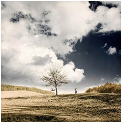
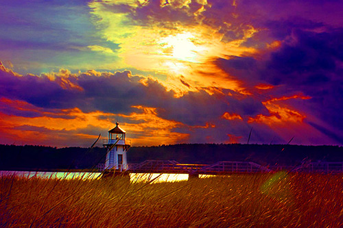
 This image is displaying happiness as complimentary colours are present which draws people's attention in. A mix of bright vibrant colours usually indicates ideas of fun and brings back nostalgia towards childhood as children's toys are vibrant within colour to appeal to small children.
 However in this image its expressing sadness through the colours and lack of colours. It makes us feel sad as all our attention is drawn to the blue and black as the white isolates that and draws our attention towards it.
Complimentary colours
Colours that are opposite each other on the colour wheel are complementary colours. They “cancel” each other, if you mix them hence why they contrast each other and make it extremely appealing towards the eye.

Analogous colours.
Analogous colours are located next to each other on the colour wheel. Orange and yellow, for instance, have an analogous colour harmony as do blue and purple. Unlike complementary colours, analogous colours create a more soothing look to photos.

Muted is just another word for greyed, dulled or desaturated. It refers to colours which have a low saturation (or Chroma). The opposite of a muted colour is a vivid colour. This type of colour photography is very calm to look at as the colours present aren't bold.

Saturated colours.
Saturation refers to the intensity of a colour. The higher the saturation of a colour, the more vivid it is. The lower the saturation of a colour, the closer it is to grey. Lowering the saturation of a photo can have a “muting” or calming effect, while increasing it can increase the feel of the vividness of the scene. These types of photos really catch peoples eyes as the colours are so bold.

Research(of artists and techniques)
William Eggleston.
William Eggleston is an American photographer. He is widely credited with increasing recognition for his colour photography. Born 27 July 1939 (age 80 years old). Since the early 1960s, William Eggleston used colour photographs to describe the cultural transformations in Tennessee and the rural South. He registers these changes in scenes of everyday life, such as portraits of family and friends, as well as gasoline stations, cars, and shop interiors. Personally I really like his photos as they're old fashioned, the colours are either vibrant or muted in his photos which doesn't correlate to when you usually think of old fashioned photographs, hence why it stands out.


Connotations and denotions
What I like about this photo is its very eye catching as the bottle of sauce, chips and red jar are analogous colours and the sunlight creates a lighter shade of each colour and contributes into intensifying the depth. There's also a yellow hue on the salt shakers which plays into the red- yellow analogous colours. Its very aesthetic to the eye as the red lining on the side of the seat reflecting on the window and it makes the photo look more pleasing as it links with the red analogous theme.
This photo brings across a sense of isolation as the phone is isolated, the yellow hue brings across a sense of danger, it reminds me of a scene in an old horror movie.
Image bank
(visual ideas for the shoot)
Selected Images
Contact Sheets.


Selected images.


Images that require improvement.


I believe the photo of the yellow flowers isnt that good because its not all in frame and i used a close up setting on my camera when i should've gotten the whole flowers in frame then within editing i couldve added a yellow hue although Eggleston doesnt photography nature as much as things that are man made. Despite this the yellow is really vibrant within the flowers.
The feather photo is good but there isnt that much colour present unlike Eggleston's photos. Although i did get the whole feather in the frame as the focuses upon one or similar objects and creates a hue on them, i wouldnt be able to do this as its grey therefore it wouldnt be vibrant in any way.
AO3: Record ideas, observations and insights relevant to intentions, reflecting critically on work and progress.
Discuss the ideas you had
say something about where you got your inspiration from e.g. egglestone and colur theory.
My idea for recording colour was to photograph the landscape and nature exploring different colours present such as complimentary, muted ,saturated colours and analogous colours. I was inspired from my research of William Egglestone's s images with regards to the composition and colour theorys used. His use of colours and framing gave me an idea to photograph different objects and bulidings within Harlow.
The images came out as I expected, however I had to pay particular the framing and composition achieve the images i wanted to.
With reference to the Best selected images...
The image of the house with red cutains was taken so i got everything nicely in frame. This was done due to the two sets of complimentary colours present. I did this so the eye was drawn to the conrasting colours present. This image was inspired by my research on colour theorys.
The image of the green go sign was also inspired by the colour theory research as there are complimentary colours present as there are hints of red. Within ediiting i will change the saturation so the photo is vibrant.
The flower image was inspired by my research on colour theory due to the analogous colours that the flower presented. I got all of the flower in shot to replicated ideas from Egglestone's images.
For the whiteboard image, its abstract hence why i like it. in ediitng i will turn up the saturation to make the colours pop. Before taking this photo i took photo with the whiteboard in full frame; but i didn't like the way it turned out and despite that i feel like this one reflects Eggleston more as its abstract.Because of the colours this photo reminds me of the tricycle photo of Eggleton's as there is more red than blue
The photo of the red chairs inspiration came from the reasearch on colour theorys alongisde William Egglestone. my idea for framing is inspired by egglestone and the colours as complimentary. The colours in the photo are vibrant as they are but in editing i will increase the saturation to make them pop.
T
The blue house photo was souly inspired by William Egglestone as he used muted colours sometimes and i tried to focus on the main part of the house that interested me. In editing i can turn down the offset to make it appear more old fashioned as Eggleston's photos were taken around the 1960's, but its also linked to the modern day as houses like that wouldnt be that common in the 1960s.
For the last photo i was inspired by the research on colour theorys as the complimentary colours caught my eye. In editing i will increase the offset to make it appear more old fashioned as Eggleston's photos were taken around the 1960's and i want my photos to reflect that.
AO2: Explore and select appropriate resources, media, materials, techniques and processes, reviewing and refining ideas as work develops.
Editing.


 This is my favourite photo because of how vibrant it is.


Editing.


For this photo i turned up the blue and red in selective colour to make them more vibrant. Before taking this photo i took photo with the whiteboard in full frame; but i didn't like the way it turned out and despite that i feel like this one reflects Eggleston more as its abstract. I turned down the brightness and vibrance a vast amount so the main focus would be upon the colours on the whiteboard. Because of the colours this photo reminds me of the tricycle photo of Eggleton's as there is more red than blue.

 This is my favourite photo because of how vibrant it is.

I believe the photo of the blue house is one of my best because its all one colour
and i turned down the offset to make it appear more old fashioned as Eggleston's photos were taken around the 1960's. I believe to improve this photo i could make the blue colour more vibrant as Eggleston's photos are very vibrant.
I really like this photo of mine as the yellow and blue are complimentary colours, its reflected in my colour research. and i felt through editing i made the colours more vibrant by turning up the saturation and selected colour to focus on these colours. Although i couldnt really add a hue because they would cancel each other out
· This section will record the resources, materials and processes and techniques used to create your work
· Where Photoshop has been used you will need to show how the work developed through use of screen shots to record the editing process.
· Where appropriate use image and text to show how/why the images were edited../transformed.
AO1: Develop ideas through sustained and focused investigations informed by contextual and other sources, demonstrating analytical and critical understanding.
· (Here you will discuss how you developed your work based on your research of e.g. artists/photographers, theory e.g. relating to the formal elements, an idea you had following a visit to an exhibition, etc).
cfccc
The artist research was helpful as I realised that the theory on colour meant that I could tackle the subject from a range of perspectives and colours. My research of William Egglestone helped me to focus on the hard geometric shapes of modern cities. This was helpful to me as the college is located in Harlow where many of the buildings gave me opportunities to photograph geometric shapes. The research on line and emotion/mood was not particularly helpful to this study, however some of the shots were composed using leading lines where the perspective of the buildings draws the viewer into the composition... this aspect of research was useful.
cfccc
Within editing these photos I tried to focus upon one colours and to create a hue of that colour all around the photo like Eggleston does in his photos. Also with single objects I tried to get all of it in frame but I didn't succeed like the green " go " sign, I could've gotten it all in frame.
Although with my attempt to get every object in frame, I didn't succeed in the green stop sign photo, I could've gotten it all in frame. if i was to take this photo again I would make sure to get it all into frame so it would look similar to Eggleston's photos. Despite that I really like the way this photo turned out as there are hints of red that compliment green as reflected in my colour theory research.
In regards to the 1st photo with the red blinds. Personally I like this photo due to the 4 complimentary colours within the photo that contrast each other. I tried to imitate Egglestone by adding a red-ish hue to it although its eliminated the highlights off the bush as its green. I made the colours more vibrant by turning up the saturation. This photo could've been better if i got all of it in frame as Eggleston tends to do in his photos.
In regards to the 1st photo with the red blinds. Personally I like this photo due to the 4 complimentary colours within the photo that contrast each other. I tried to imitate Egglestone by adding a red-ish hue to it although its eliminated the highlights off the bush as its green. I made the colours more vibrant by turning up the saturation. This photo could've been better if i got all of it in frame as Eggleston tends to do in his photos.
· You must critically analyse the your work (how good is it, how can it be improved)
AO4:Present a personal and meaningful response that realises intentions and, where appropriate, makes connections between visual and other elements.
· Post the best 4 images after editing with Photoshop.
· (At the end of the entry you will discuss whether you have produced a personal and meaningful response, this means (are my images creative/relevant to the subject area studied/connected and influenced by any research undertaken).
I believe that I have produced a strong series of images inspired by my research on colour, composition and the images of William Egglestone... The final images produced were refined by developing the selected colour, hue, turning up the contrast and turning down the contrast.

No comments:
Post a Comment